Layout helper based on CSS flexbox specification designed to serve you as quick flexbox shorthand by using two custom html attributes — layout and self.
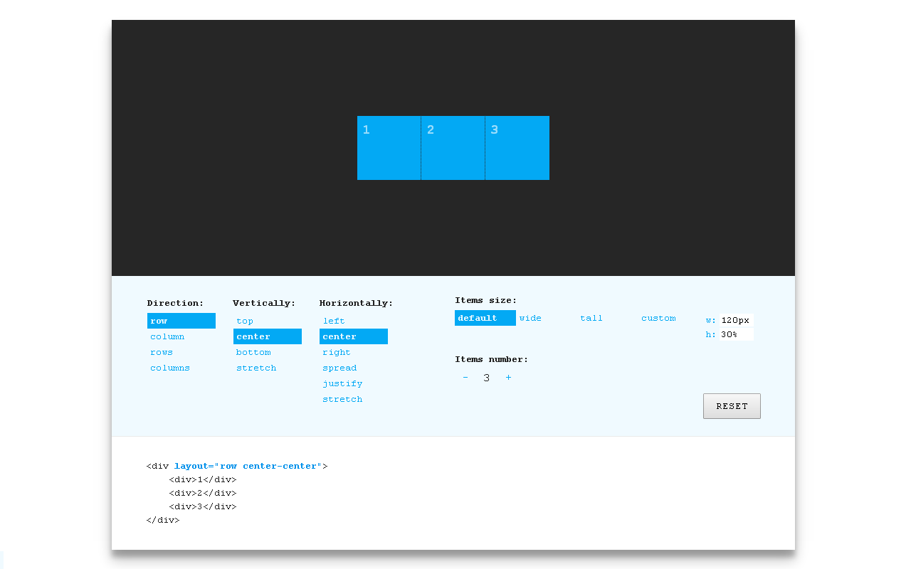
Items distributed in a row and centered within container:
<div layout="row center-center">
    <div>1</div>
    <div>2</div>
    <div>3</div>
</div>
Try live — interactive demo
- Dedicated HTML attribute — separated layout markup, semantic & concise syntax.
- Beyond grids — ratio relationships, element sizes based on a scale.
- Rapid prototyping — design in browser, quick iterations, no need to write CSS for layout.
- Solid base — ease to extend and customize.
Several quick start options are available:
- Download the latest release
- Clone the repo:
git clone https://github.com/StefanKovac/flex-layout-attribute.git. - Install with npm:
npm install flex-layout-attribute.
- Insert flex-layout-attribute.min.css in document HEAD:
<link href="path/to/css/flex-layout-attribute.min.css" rel="stylesheet">- Add layout attribute to html elements:
<div layout="row center-justify">
    ...
</div>- Clone the repo:
git clone https://github.com/StefanKovac/flex-layout-attribute.git. - Install dependencies:
npm run setup. - Build FLA:
gulpor set watcher:gulp watch
Interactive demo, documentation and snippets — http://progressivered.com/fla/
FLA is released under the MIT license.